Does Your Art Business Need a Media Kit?
“Luck is what happens when preparation meets opportunity.”
Have you ever been in a situation that you wish you had been better prepared for? Perhaps you met someone that you wanted to make certain remembered you and your art, but had no tools to solidify the relationship.
When these opportunities arise, it takes more than luck to be prepared. As an artist and business owner, you are your own best representative. This means an important component of your artistic practice is marketing. Self-promotion makes many of us squirm a bit; but if your path is mapped, it’s an easier one to travel.
Presenting yourself in a way that potential relationships can be forged often means creating marketing collateral that reflects your practice as a whole and is readily available to share with publications, galleries, collectors, and other connections. These pieces may include a media or press kit, a portfolio or an exhibit catalog promoting a specific event.
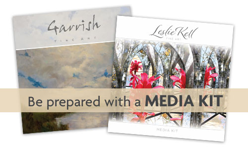
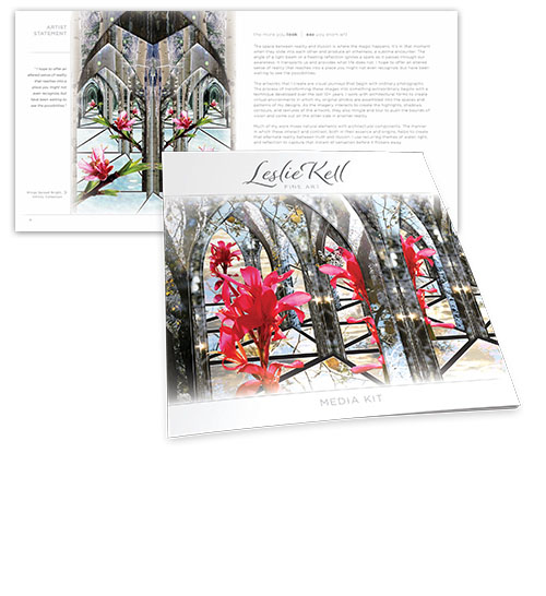
An often over looked component of your marketing materials is a media kit, also known as a press kit. Now, you may be asking, how is this different than my business card and a link to my website? Well, it is. Think of it as a visual CV, a concise overview in an easily accessible format that tells your story that can be used for gaining exposure and publicity. A media kit can take on different forms, it can be a printed piece or a link on your website, or both. It can also be a collection of materials in a folder. The point is, it’s all in one place and it is a comprehensive professional presentation that rises to meet opportunities.
The good news is, you probably have all the pieces and parts you need already. It’s just a matter of melding the information into a concise presentation that can be delivered into the hands of people who can help move your career to the next level.
Your media kit should contain your CV with background, education, awards and reviews, as well as your artist statement and bio. You may also want to include excerpts from articles or reviews, awards and testimonials. Where possible, explain your process and highlight your specialties. You can also promote specific events or workshops you offer.
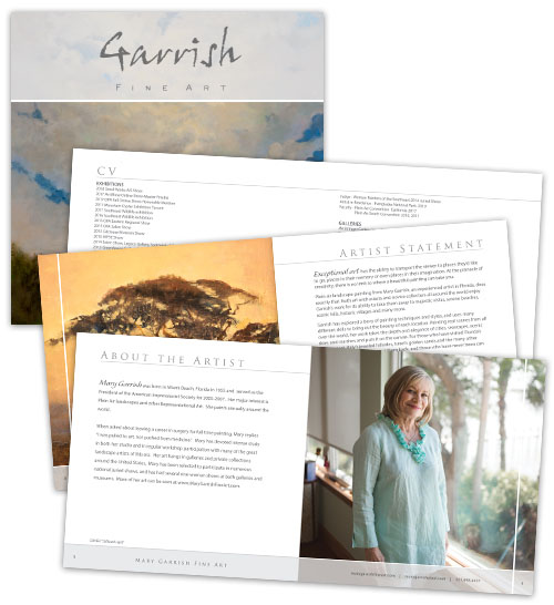
Oh, and of course your artwork! The vast majority of the pages should be filled with images. Be sure to include a head shot and samples of featured artwork. In addition, in situ and exhibit photos are highly effective in showing the scope of your work. Detail shots, process photos, and a peek at your studio will add more to the story as well.
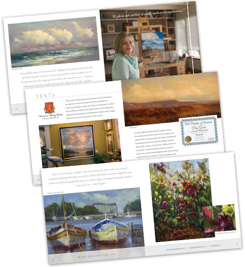
“As a landscape painter, I was looking for a creative way to market my art. Luckily I found Leslie at Kell Creative. She was inventive, responsive and very knowledgeable. I would highly recommend Leslie and a media kit to any small business who is looking for helpmarketing their product.”
–Mary Garrish
With online printing becoming ever more accessible and cost effective, I highly recommend this information be compiled into a printed booklet. The physical piece will leave an impression on anyone you meet and is less likely to be discarded and forgotten than an email or a business card.
While you can hire a graphic designer to help with this project as Mary did, there are many well designed online applications for these projects. If you choose to create your materials yourself, here are a just few design tips: Maintain an overall vision of your branding so that everything you produce is easily recognizable and points back to your business’ identity. This includes choosing a readable font and color scheme and sticking with it. Keep your design simple and let your artwork be the most colorful element on the pages. Run spellcheck and proofread, then proofread again.
Remember the part about being prepared?That implies thinking ahead… so as you create your layout, be sure to consider how you are going to present the finished piece. I like to work in an 8 x 8-inch format for many reasons. The online view of the spreads is a nice proportion, 2:1. If you choose to produce printed materials, 8 x 8 is a fairly standard size for online printers. Keep in mind that in most cases, page count should be a multiple of 4 if you intend to print as a booklet: 8, 12, 16, 20, 24 etc. If you can, always use good quality paper, it’s a well-spent upgrade to the final product.
Keep in mind, while the name “media kit” implies that you will be targeting publications with this material, this is also an effective tool to share with potential buyers, galleries and collectors. You might choose to produce similar material for a special event. The catalog pictured below was created for an exhibit featuring six digital artists. While it was an effective marketing tool during the exhibit, it also served afterwards to secure future shows for the group.
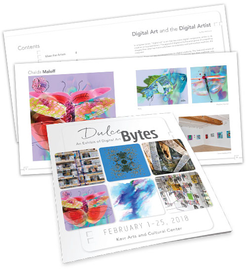
The examples shown in this article were designed by Leslie Kell of Kell Creative, LLC. Leslie offers portfolio services to artists including media kits, portfolios, branding, show catalogs and promotion, as well as in situ images and virtual hangings.
